Fields and buttons
Draw properties as fields people can edit, and buttons that run operators.
A field shows a property and lets people change it: a checkbox, a number, a text, a dropdown. A Button runs an operator, the action behind a button. Both draw where you connect them in an interface flow, e.g. after a Panel's Draw output.
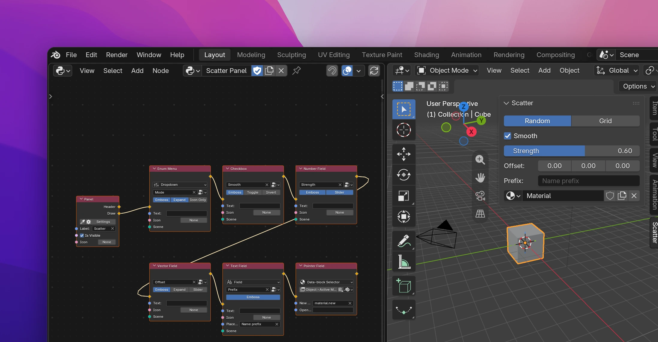
Showing a property
Every field node draws one property. It can be one of your add-on's properties or any of Blender's.
Add a field for the property's type, e.g. Add › Interface › Number Field for a number, and connect it to a panel's Draw output.
Pick the property in the field on the node. It lists your add-on's properties of that type.
For one of Blender's properties, click the button next to the picker (the node tree icon) and switch it to Blender. Then search the property or paste its path, like scene.render.fps. See Data paths for how paths work and how to copy one from any field in Blender.
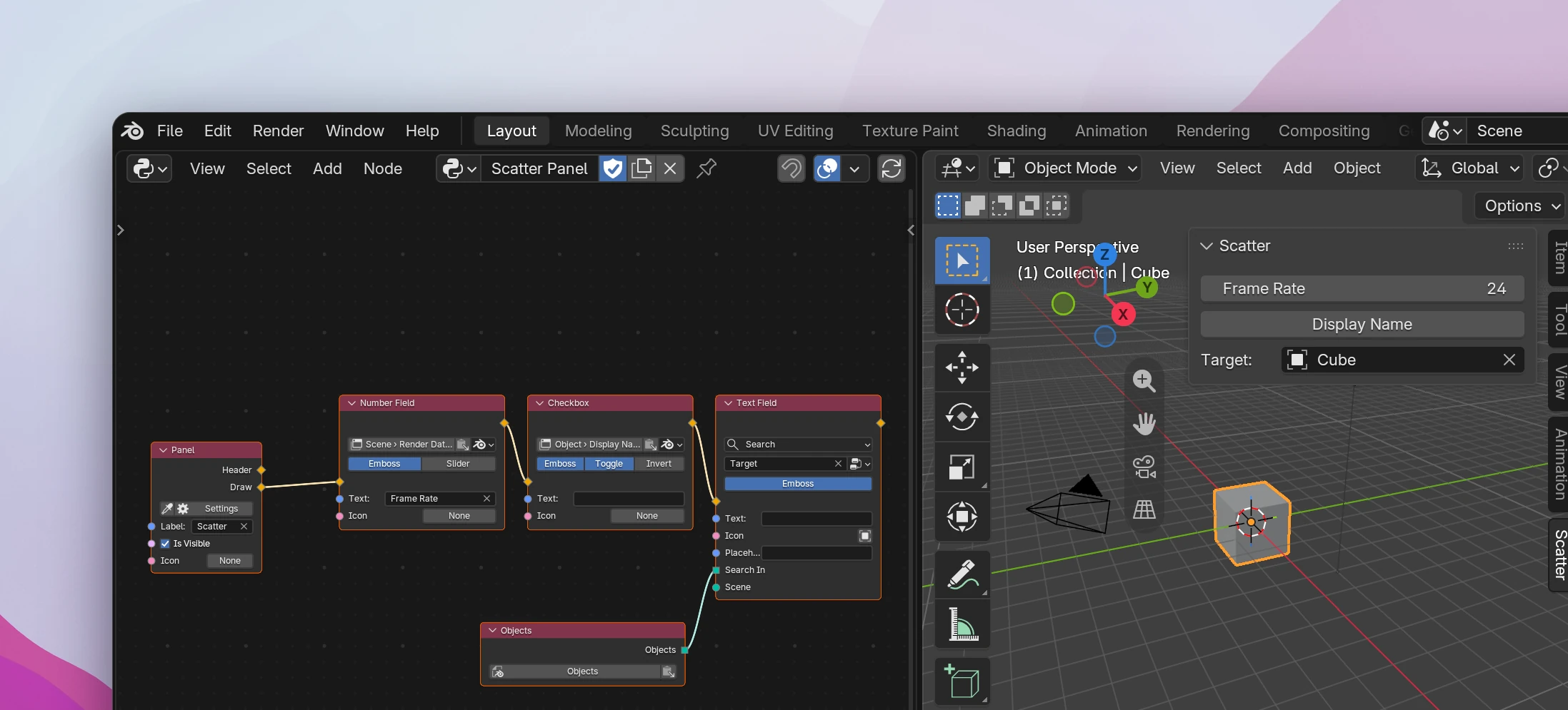
A property belongs to some data: a Scene property is stored on each scene, an Object property on each object. For your add-on's properties the node gets an input named after that data (Scene, Object, ...). Leave it unconnected to use the current one: context.scene, the active object, the active material and so on. Connect it to show the property of other data, e.g. of each object in a Draw For Each loop (see Layouts).
Some properties have no current owner, so the input must be connected:
- A property of a group needs the group item it belongs to, e.g. the Item of a UI List row.
- An Operator node's own properties only work inside that operator (its Draw flow); the input is hidden there.
- Add-on preferences find their owner on their own.
Field nodes
| Node | Draws | Styles and options |
|---|---|---|
| Checkbox | Booleans | Toggle draws a button that stays pressed while the value is on. Invert draws a checkbox that's checked while the value is False |
| Number Field | Integers and floats | Slider fills the field from the property's minimum to its maximum |
| Vector Field | Vectors and colors | Expand draws the values side by side. Slider draws each value as a slider |
| Text Field | Strings | Style Field, Text Box or Search, see below |
| Enum Menu | Enums | Style Dropdown or Icon View, see below |
| Pointer Field | Pointers (a property that holds an object, a material, ...) | Style Field or Data-block Selector, see below |
Every field has these inputs and settings:
- Text replaces the property's name. Leave it empty to show the name.
- Icon draws an icon in front, see Icons.
- Emboss (on by default) draws the field's background. Turn it off for a flat field.
In Blender mode, the path search only offers properties the field can draw: a Checkbox takes booleans, a Text Field strings, and so on.
Text Field
- Field is a one-line text field. Placeholder is the gray text shown while it's empty.
- Text Box is a field over several lines. Lines sets how many are visible. A text box has no label of its own, so a Text is drawn as a label above it. Blender versions without text boxes draw a one-line field instead.
- Search suggests names while you type. Connect a collection of Blender data to Search In, e.g. a Blender Data node with all objects (
bpy.data.objects). The field stays a string: it stores the name, not the object.
Enum Menu
- Dropdown opens a menu of the items. Expand draws them as a row of buttons instead, Icon Only shows only the items' icons.
- Icon View draws a large preview of the selected item's icon, which opens a grid of all items' icons. Scale sets its size (5 by default), Labels shows the items' names under the icons in the grid. It looks best with custom icons on the items. Text, Icon and Emboss don't apply to this style.
Pointer Field
- Field is a search field listing the data the property can hold.
- Data-block Selector is Blender's selector, like the material slot in the Material Properties: a dropdown to pick one, its name and a button to unlink it. New Operator adds a button that makes new data, e.g.
material.new; Open Operator adds a button that loads a file, e.g.image.open. Leave them empty for no button. This style has no Text or Icon input. It only works for properties that hold data-blocks (objects, materials, images, ...), not other pointers.
Buttons
A Button runs an operator when it's clicked.
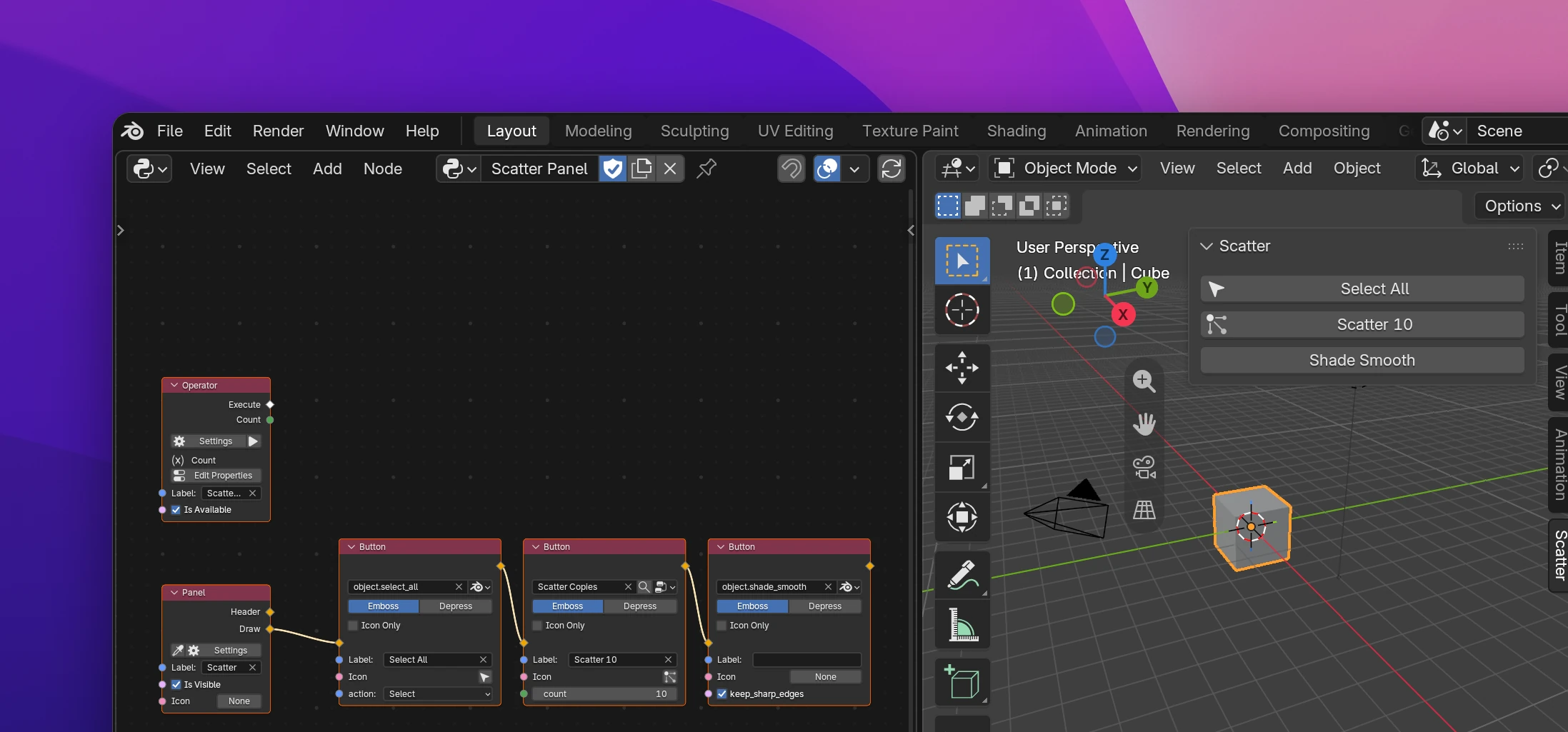
Pick the operator on the node: one of your Operator nodes, or, after switching the button next to it to Blender, any of Blender's operators (search by name or by id like object.select_all).
The operator's properties become inputs on the node. Set them to make one operator do different things from different buttons: Blender's Select All has an action input (Toggle, Select, Deselect, Invert), so one button selects and another deselects. Inputs left at the operator's default value aren't passed, so the operator behaves as if the property was never set.
| Input or setting | |
|---|---|
| Label | The button's text. Empty shows the operator's name |
| Icon | An icon in front of the text |
| Emboss | Draws the button's background (on by default). Off draws a flat button |
| Depress | Draws the button as pressed in |
| Icon Only | Draws only the icon, no text |
Whether a button opens its operator's dialog or runs it right away follows the layout. Change it with Set Layout State › Buttons Run (see Layouts).
Other nodes that draw buttons:
- Link opens a web page, see Text and links.
- Operator Menu, Menu and Popover open a list of choices, a menu or a panel, see Menus.
Limitations
- A Blender operator's inputs are named by their Python names (
action,keep_sharp_edges), not by the labels Blender shows in the operator's settings. - Not every operator property gets an input: properties holding data or lists (pointers and collections), enums where several items can be on at once, boolean arrays, and properties Blender hides aren't offered. Your own operators' Group and Collection properties aren't offered either.
- Search needs a collection reached by a path, like
bpy.data.objectsorscene.objects. A list made by other nodes doesn't work; the node shows an error. - Fields of your add-on's Object properties use the active object when Object isn't connected. Without an active object the panel can't draw them and the error shows on the node. Hide the panel then (its Is Visible input), or check for an object with a condition.
Fields are layout.prop() calls on the data that holds the property. Options only appear when they differ from Blender's defaults:
self.layout.prop(context.scene.scatter_tools, "mode", expand=True)
self.layout.prop(context.scene.scatter_tools, "strength", slider=True)
self.layout.prop(context.scene.render, "fps", text="Frame Rate")
self.layout.prop(context.object, "show_name", toggle=True)
scatter_tools is the group your add-on's Scene properties are stored in, named after the add-on's module.
The other styles use Blender's templates:
| Style | Call |
|---|---|
| Text Field › Search | layout.prop_search(data, "target", bpy.data, "objects") |
| Text Field › Text Box | layout.textbox(data, "notes", initial_visible_lines=3, placeholder=...), through a helper that falls back to layout.prop |
| Enum Menu › Icon View | layout.template_icon_view(data, "preset", show_labels=True, scale=5.0) |
| Pointer Field › Data-block Selector | layout.template_ID(context.object, "active_material", new="material.new") |
A button is layout.operator(). Inputs that differ from the operator's defaults are set on the returned properties:
op = self.layout.operator(
    "object.select_all", text="Select All", icon="RESTRICT_SELECT_OFF"
)
op.action = "SELECT"
self.layout.operator("object.shade_smooth")