Icons
Put Blender's icons or your own images on labels, buttons, fields and menus.
Every node that draws text has an Icon input: click the button on it to search Blender's icons. For your own images, an object's type icon or a large logo, use the icon nodes in Add › Interface › Icons.
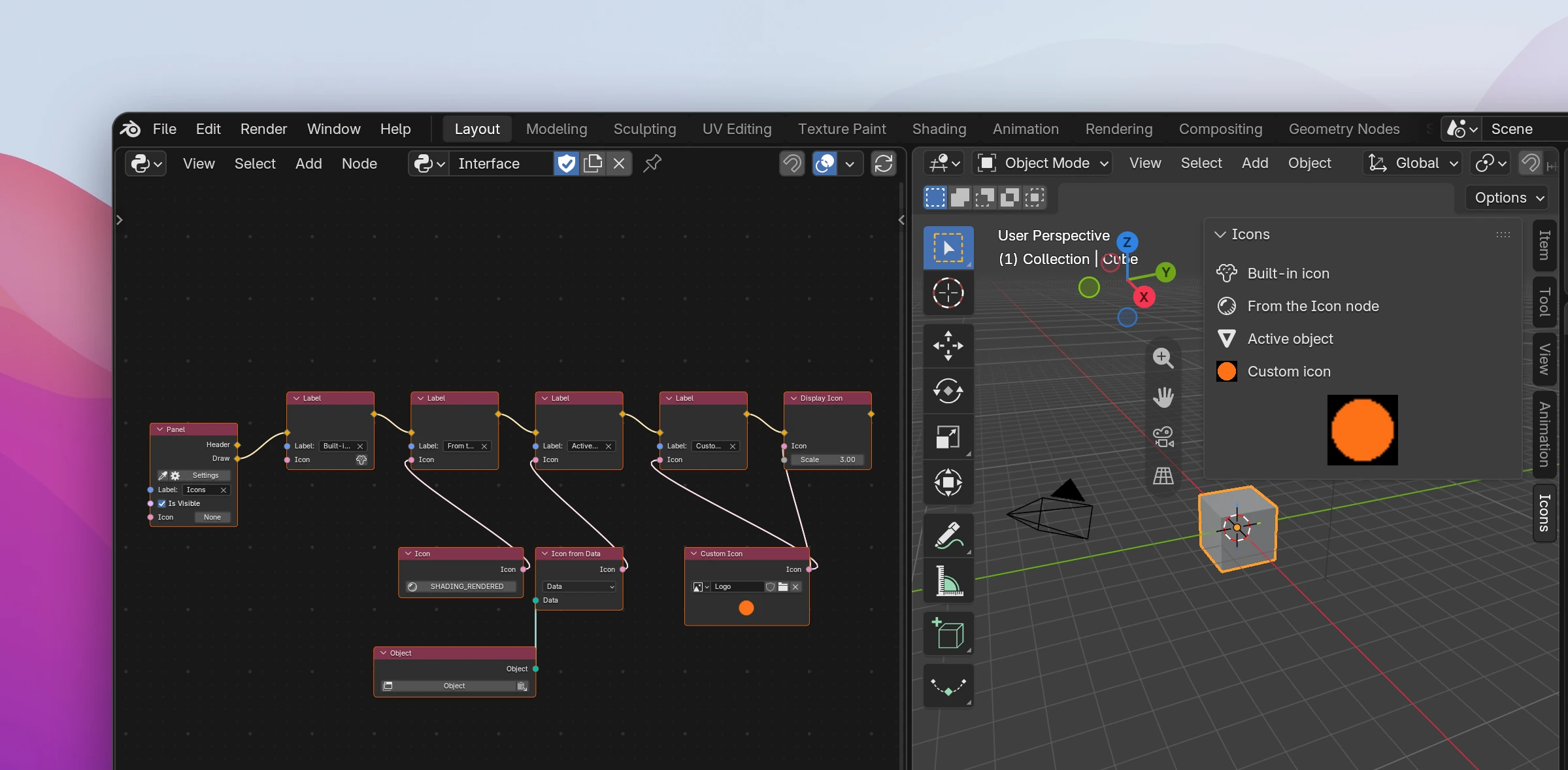
Where icons go
These nodes have an Icon input: Label, Multiline Label, Link, Button, Operator Menu, Menu, Popover, Panel, the fields (Checkbox, Number Field, Text Field, Vector Field, Enum Menu, Pointer Field) and Enum Item.
An icon on a label, button or field is always the size of the text. To draw one larger, use Display Icon.
Icon nodes
| Node | |
|---|---|
| Icon | One of Blender's icons, picked on the node. Connect it to several nodes that should share an icon |
| Custom Icon | An image as an icon. Pick an image or open an image file on the node; it's copied into the add-on's icons/ folder and loaded when the add-on first needs it |
| Icon from Data | The icon Blender shows for data. With Source Data: the icon of the connected Data, e.g. an object's type icon or a material's preview. With Source Enum Item: the icon of an item of an enum property: Data is what holds the property, Property its Python name and Item the item's identifier. Without data (no active object) it's no icon |
| Display Icon | Draws an icon on its own, Scale times as big (3 is three times). For a logo from a Custom Icon or a large preview from Icon from Data. Blender's own icons don't get bigger: they're drawn at their normal size in the middle of the larger space |
Connected icons are icon ids, the numbers Blender's icon_value arguments take. You can also connect an Integer with an icon id, or a String with an icon's name ("MESH_DATA").
Limitations
- Custom Icon needs the image's file: pack the image (Image › Pack) or keep its file where the .blend can find it. An image painted in Blender and never saved can't be used. Editing the image file doesn't rebuild the add-on; change something in the tree or reload.
- The image ships as it is. Blender scales it down for the icon, so use a small square image (32 or 64 pixels).
- Blender's icons are stored by name. An icon this Blender doesn't have (renamed or removed in another version) is an error on the node.
- Enum items listed with a property (sidebar Properties) only take Blender's icons. For custom icons in a dropdown, use an Items Function with Enum Item nodes (see Properties).
- A Panel's icon is the icon of its sidebar tab, shown instead of the tab's name with Compact Tabs (right-click the tabs). Only panels in a sidebar have tabs. Blender 5.2 added it; older versions ignore it. When several panels share a tab, give them the same icon. For an icon in the panel's header, draw a Label with an icon in the Header flow.
A picked icon is passed by name, a connected one by id:
self.layout.label(text="Built-in icon", icon="MESH_MONKEY")
self.layout.label(text="Custom icon", icon_value=custom_icon_id("logo.png"))
self.layout.label(
    text="Active object",
    icon_value=bpy.types.UILayout.icon(context.object)
    if context.object is not None
    else 0,
)
self.layout.template_icon(icon_value=custom_icon_id("logo.png"), scale=3.0)
custom_icon_id and icon_id (names to ids, for the Icon node and connected strings) are helpers in the add-on's utils.py. custom_icon_id loads the images of icons/ into a bpy.utils.previews collection the first time they're used.