Layouts
Arrange buttons and fields in rows, columns, boxes and grids.
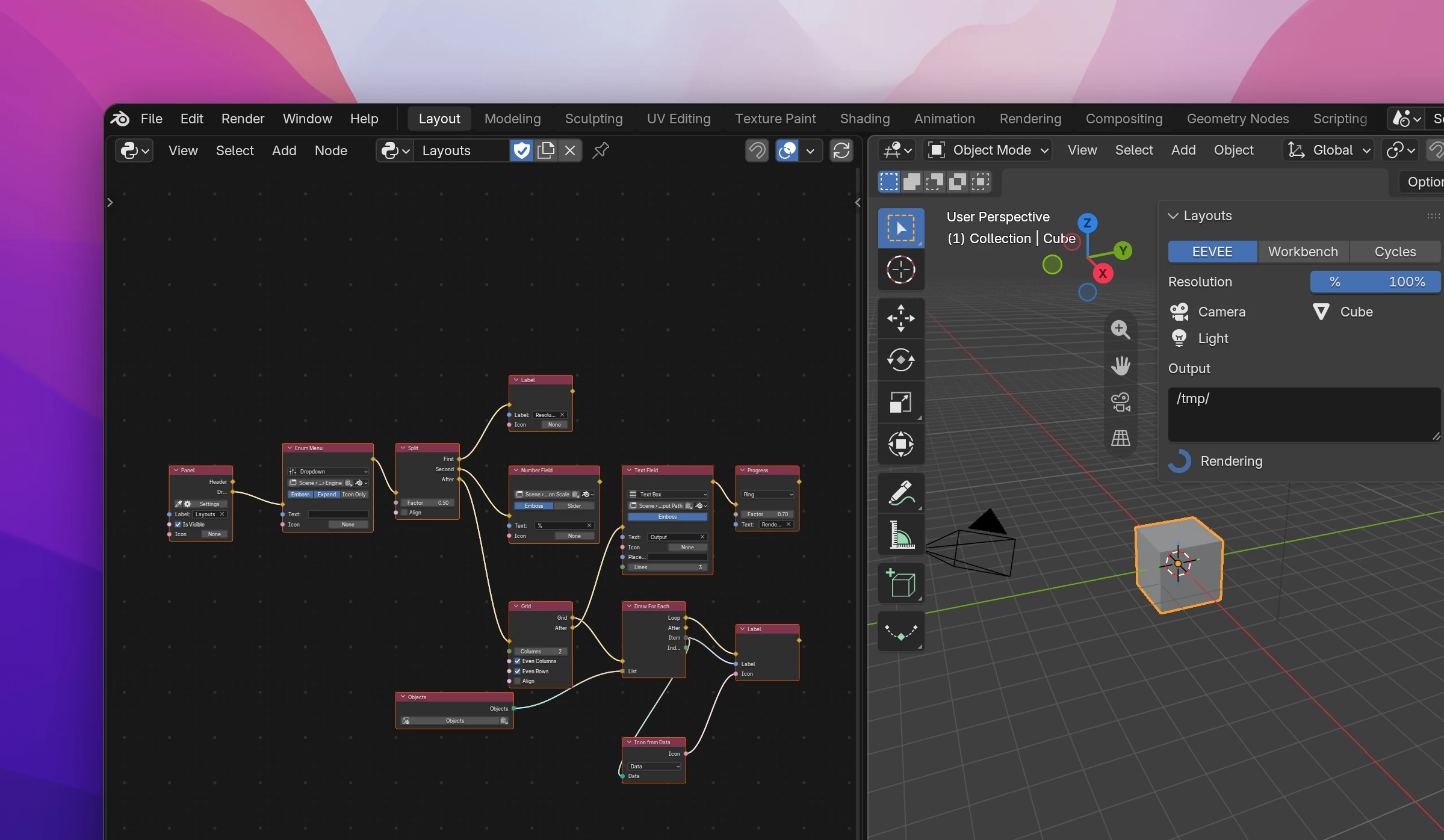
Interface flows draw from top to bottom. Layout nodes (Add › Interface › Layouts) change where the nodes after them draw: everything connected to a Row's Row output sits side by side, and its After output continues below the row.
Containers
Containers have one output for their contents and After for what comes below them. Containers can go inside each other: a Row inside a Box inside a Column.
| Node | Inputs | Does |
|---|---|---|
| Row | Align, Heading | Draws Row side by side. Align joins the items without gaps, like the X, Y, Z fields of a vector. Heading is a label in front of the row |
| Column | Align, Heading | Draws Column below each other |
| Box | Draws Box in a framed column | |
| Split | Factor, Align | Two columns side by side, First and Second. Factor is the first column's share of the width: 0.3 makes it narrower, 0.5 (the default) splits evenly. A column with nothing connected still takes its share |
| Grid | Columns, Even Columns, Even Rows, Align | Fills Grid into a grid, row by row. Columns 0 fits as many as there's room for. Even Columns / Even Rows give all columns the same width and all rows the same height |
Inside a panel, Subpanel adds a collapsible section, and Draw For Each draws its flow once per item of a list.
Changing the layout
| Node | Does |
|---|---|
| Separator | Space between elements. Show Line draws a line instead, Factor is the size (1 is the normal space) |
| Set Layout State | Enabled off grays out what follows and makes it unclickable; Active off only grays it out (it still works, like Blender's inactive settings); Alert draws it red. Buttons Run sets how buttons after it start their operator: Invoke shows dialogs and popups, Execute runs right away without them, Unchanged keeps it as before |
| Set Layout Scale | Makes what follows bigger: Scale X / Scale Y, 1 is normal, 0 keeps Blender's default. With Fixed Scale on, the inputs are Units X / Units Y: a fixed size in UI units (one unit is the height of a normal button) |
| Set Property Layout | Split draws the property's name to the left of the field, like in Blender's own panels. Decorated adds the keyframe dot to the right of animatable fields |
| Reset Layout | Its first output continues where it is; Reset continues in the panel's own layout, outside of rows, boxes and columns |
The three Set nodes change only what comes after them: they draw it in a layout of their own (a row inside a row, a column otherwise). Elements before them, and after a Reset Layout, keep their size and state. Connect a condition to Enabled to gray out settings that don't apply, e.g. when a checkbox above is off.
Reset Layout
After a Row or Box, the flow inside it can't get back out on its own: every node after a Row output draws in the row. Reset Layout jumps back to the panel's (or menu's) outermost layout, so the nodes after Reset draw below everything. Use it to end a row at the end of a long chain without going back to the row's After output.
Set Context Data
Set Context Data gives the buttons after it data their operator can read as context.<Name>. Connect the data to Data and type the name to Name (item by default, it has to be a valid Python name).
This is how a button knows which item its row belongs to: in a Draw For Each over the objects, set item to the row's object, then add a button. In the operator, read it with a Python Expression context.item. The data is there while the operator runs from that button, not from a shortcut or the search.
Drawing other things
| Node | Inputs | Does |
|---|---|---|
| Progress | Factor, Text | A progress bar or ring. Factor goes from 0 to 1, Text is shown in the bar or next to the ring. The dropdown on the node picks Bar or Ring |
| Display Preview | Data, Show Buttons | The rendered preview of a material, texture, light or world, like the one in the Material Properties. Show Buttons adds the preview type buttons (sphere, cube, ...). Nothing is drawn while Data is None |
Each Display Preview keeps its own size (drag its bottom edge) by an id made from the node's label.
Each node is one call on the current layout (self.layout in a panel's draw()), and the contents of a container draw into the new layout:
| Node | Python |
|---|---|
| Row / Column | row = layout.row(align=True, heading='...'), layout.column(...) |
| Box | box = layout.box() |
| Split | split = layout.split(factor=0.3), then split.column() twice |
| Grid | layout.grid_flow(row_major=True, columns=0, even_columns=True, even_rows=True) |
| Separator | layout.separator(factor=1.0, type='LINE') |
| Set Layout State | col = layout.column(), then col.enabled, col.active, col.alert, col.operator_context |
| Set Layout Scale | col.scale_x, col.scale_y, or col.ui_units_x, col.ui_units_y |
| Set Property Layout | col.use_property_split, col.use_property_decorate |
| Reset Layout | The nodes after Reset draw into self.layout again |
| Set Context Data | layout.context_pointer_set('item', data) |
| Progress | layout.progress(factor=0.7, text='Rendering', type='RING') |
| Display Preview | layout.template_preview(data, show_buttons=True, preview_id='...') |